408 S Superior St., Albion, MI 49224 | 517-680-7957
Smart Strength needed a logo redesign that would appeal to its target audience while conveying the core philosophy behind Smart Strength: “Work Smarter Not Harder.”

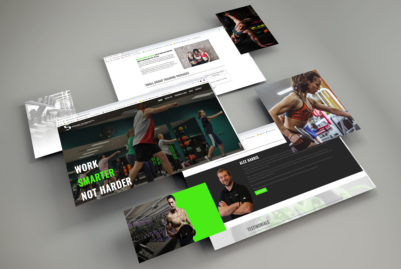
The web design layout is visually striking and is optimized for both desktop and mobile devices, featuring an eye popping color scheme with bright greens, grays and deep blacks. Together, these elements are designed to portray movement and give visitors a rush of energy while remaining approachable for interested customers looking to take control of their health & fitness. BSM not only handled the design and development of the site but was also tasked with domain purchase, setting up hosting, & email setup.

