408 S Superior St., Albion, MI 49224 | 517-680-7957
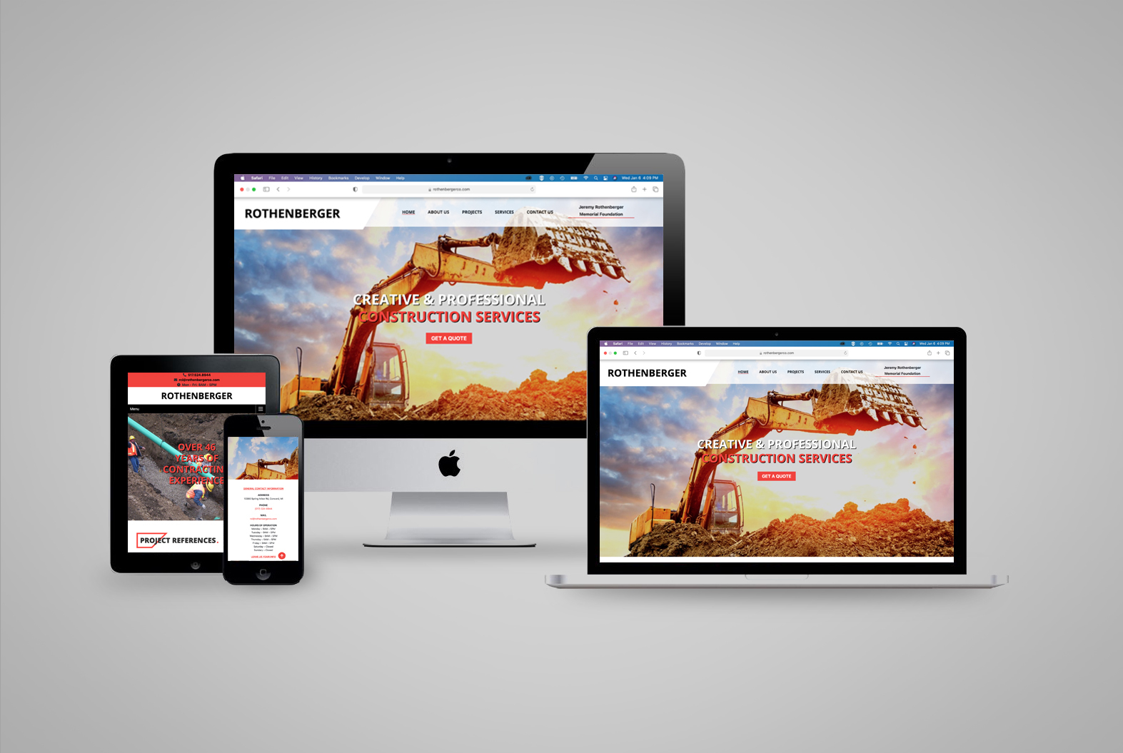
The original site was outdated and needed to be migrated to a new host to take advantage of updated technologies and a major boost in performance. Icons on the new site highlighted services are key to helping customers quickly identify the services that they are interested along with easy-to-understand explanations. Colorful and compelling headers for each section invite the reader in and dedicated product and services sections helped provide a gateway for customers to get more information and take action.
Overall, the site flows easier, transforming from a basic scroll to a more sophisticated parallax effect with open airy text areas that make it easier to read.
