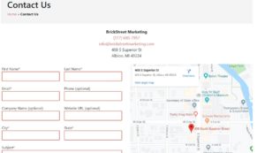
No one would argue the importance of first contact (great movie, BTW) when it comes to your website. What often gets underrated, however, is the importance of another contact: the contact us page on your website. As the bridge between you and your customers, it ranks up there as one of your most important inclusions.
It can also serve as the biggest area where you are going to get your conversions with the amount of traffic it gets. That makes it important to present it in the best light. Here are 3 tips to help ensure your contact page is all that.
- Having a contact page in the first place! This is more of an issue than you might think. Especially for portfolio-based sites. While including Facebook, LinkedIn and other social icons on your homepage are all well and good, if your prospective customers have a question that’s not covered on your website, you want to make sure that they can easily get in touch with you. If they can’t, their first impression may be that you don’t care that much about doing business with them.

- A form only, or, a broken form. When you do offer a contact form, just make sure that it is easy for potential customers to get ahold of you in other ways. Like your email or phone. (Those aforementioned social icons are good too). They might not want to spend the time filling out a form, especially if it is on the long side. You should also do a periodic check to make sure your form isn’t broken, caused by a submit button that doesn’t work or a missed update on a plugin for example. Whatever the reason, it’s a situation that can cause a possible conversion to go elsewhere.
- Outdated information. When you’re doing the periodic check on your forms, another thing to check is if your information is up to date and accurate. Along these lines, make sure your visitor is contacting the right person. If
 your company has different/multiple departments, make sure it’s easy to get them where they need to go. Grammarly does a great job demonstrating a clean page design for their users. They have three CTAs – one to visit their press page, one for help and support, and one to contact sales.
Avoiding these three contact page mistakes can go a long way in improving SEO and conversions. Questions? Feel free to contact us at BrickStreet Marketing. We’re here to help!
broken forms • contact page

 your company has different/multiple departments, make sure it’s easy to get them where they need to go. Grammarly does a great job demonstrating


